What's new

What's new in Ridelark.

What each version brought to riders, newest first. Updates that change the maps are here too.

Android app 0.6.0

A light look for bright days

On a sunny day a dark screen can be hard to read on the bars. Ridelark now has a light look, with dark text on a pale ground. Choose it in Settings › Appearance › App colours, or let it follow your phone. Dark stays the default.

Both looks were checked for riders who are colour-blind. Going over the limit and a device’s state show in words and shapes, not colour alone.

Also in this version:

  • Text and figures are in IBM Plex Sans, a typeface made for clear reading. It comes with the app, so it looks the same on every phone.
  • At the largest text sizes, your speed and the limit stay on the ride screen. Button labels wrap or stack instead of being cut off.
  • Leaving the route is noticed about a second sooner, so the new way is found sooner.
  • Pairing with the Tripper pod no longer gets stuck when the pod doesn’t answer a PIN. It starts again instead.
  • When the pod turns down a direction, it no longer keeps showing the old one.
  • Error messages are in plain words.
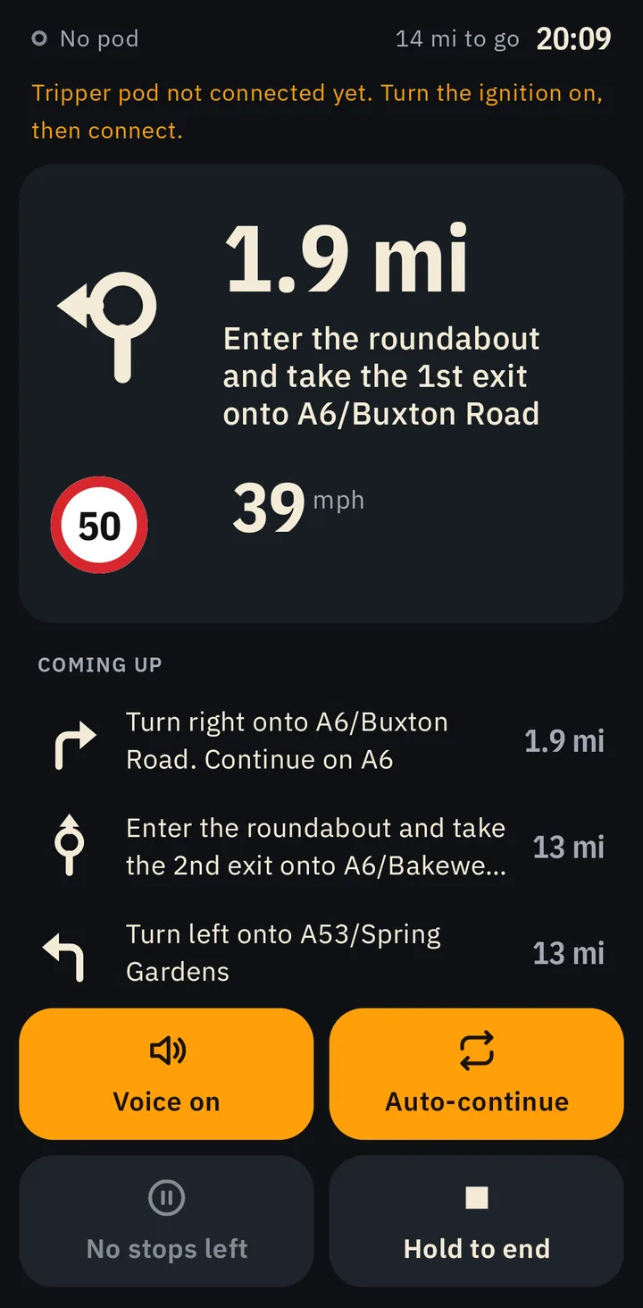
The ride screen in the dark look: 1.9 miles to a roundabout on the A6 towards Buxton, a 50 limit, 39 mph, and the next three turns below.
Dark, as before.
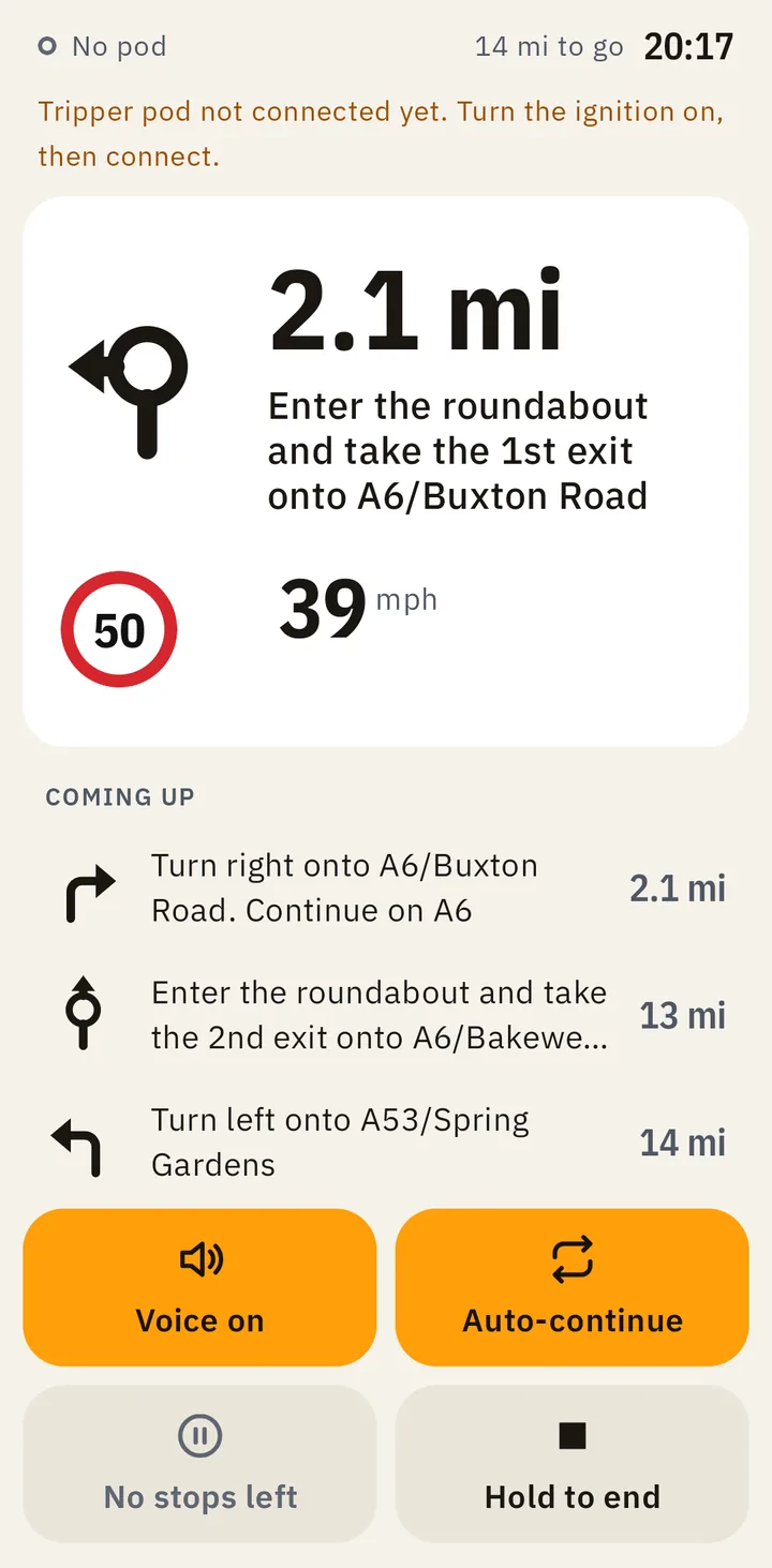
The same ride screen in the light look, with dark text on a pale ground.
The new light look, for bright days.
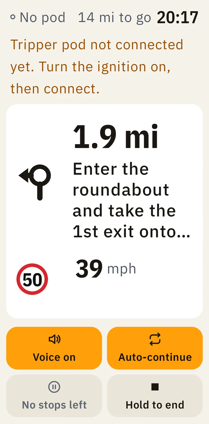
The ride screen at the largest text size. The distance, the 50 limit and the speed of 39 mph are all still on screen, and the turn's words are cut short.
At the largest text size, the speed and limit stay in view.
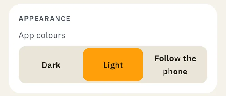
Settings, Appearance: App colours, with a choice of Dark, Light or Follow the phone. Light is chosen.
Choose it in Settings › Appearance › App colours.

What we fixed, and more about 0.6.0

Android app 0.5.1

The first beta build

This is the first version to go to the closed beta. It’s mostly about making the everyday parts of a ride dependable. A ride’s recording no longer stops after one bad GPS reading, and the app no longer crashes on a phone that’s nearly full. Those are two of more than 60 fixes.

Also in this version:

  • Text is easier to read and buttons are easier to tap. The screen reader says whether each setting is on.
  • Ridelark looks better on tablets, and the ride screen makes better use of a phone on its side.
  • Directions are spoken in English when the phone has no voice for its own language.
  • Town search is faster, and a ride that can’t be planned says why in plain words.
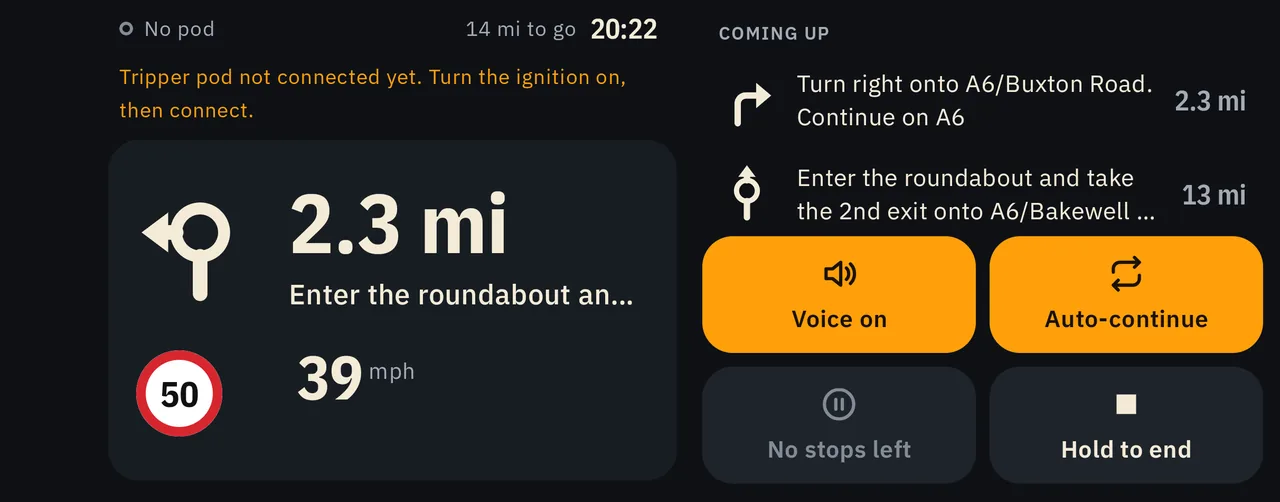
The ride screen with the phone on its side: the next turn, the 50 limit and the speed on the left, and what's coming up with the ride's buttons on the right.
On its side, the turn and your speed sit beside what's coming up.

What we fixed, and more about 0.5.1

Follow this page as a feed