
Android app 0.6.0
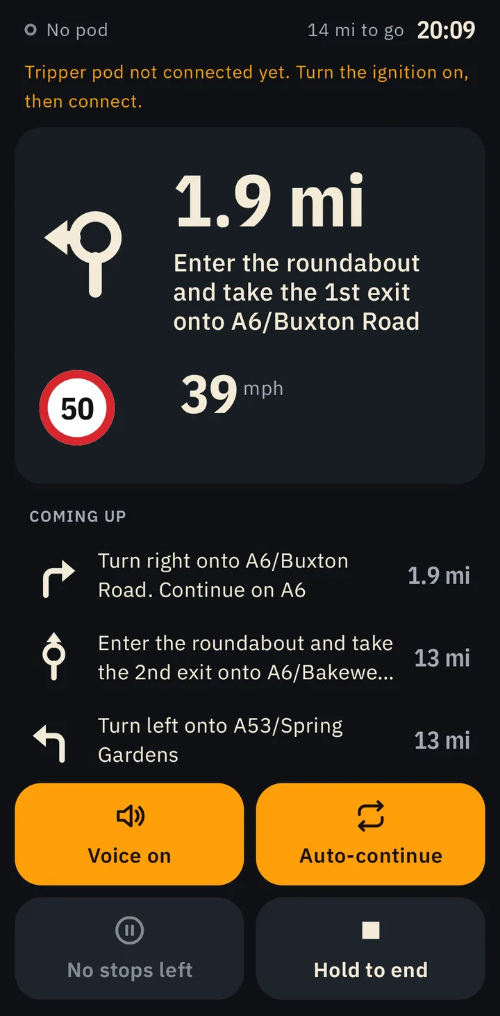
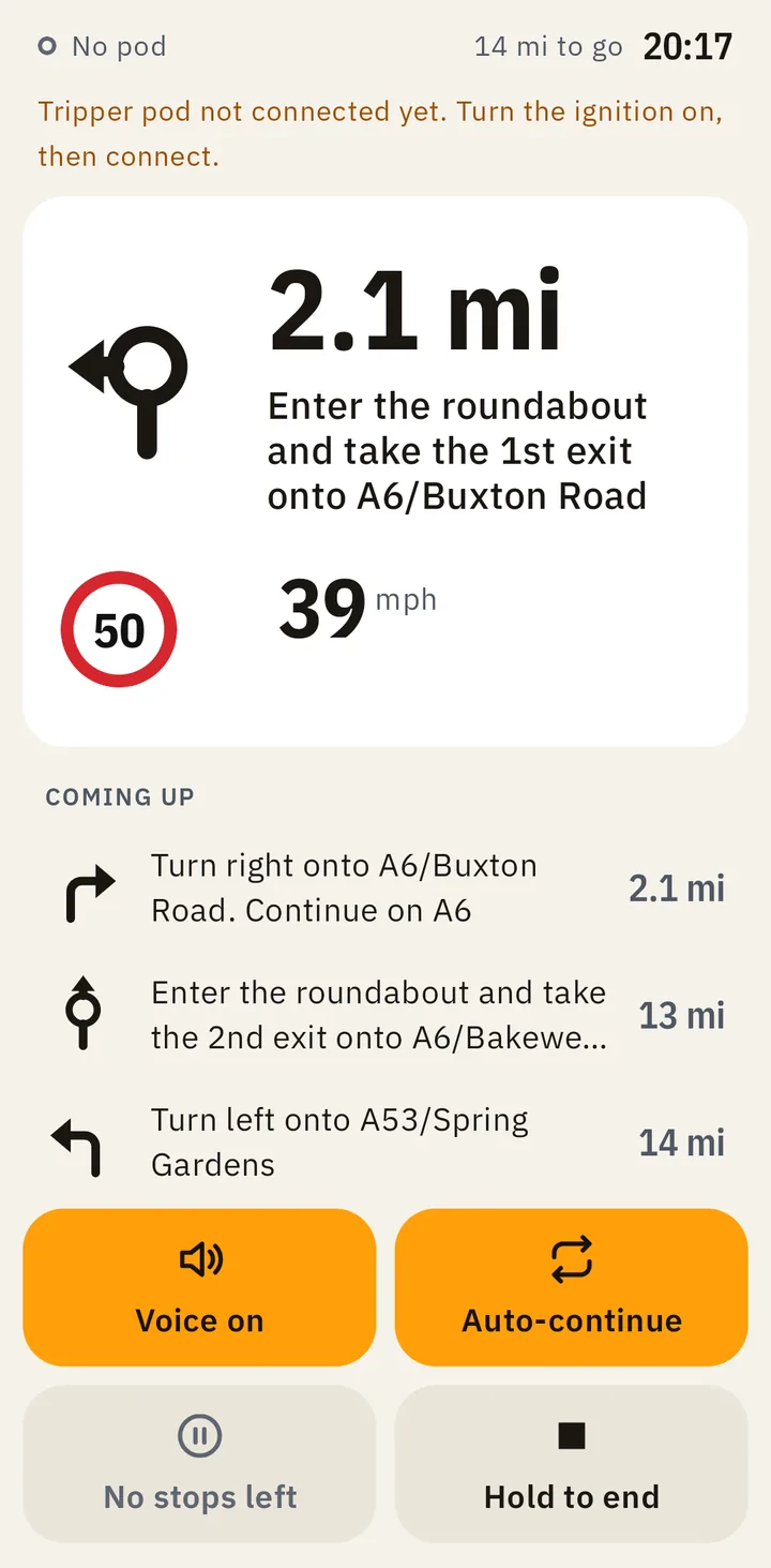
A light look for bright days
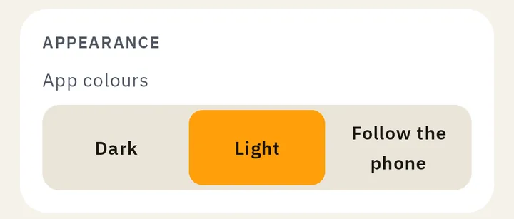
On a sunny day a dark screen can be hard to read on the bars. Ridelark now has a light look, with dark text on a pale ground. Choose it in Settings › Appearance › App colours, or let it follow your phone. Dark stays the default.
Both looks were checked for riders who are colour-blind. Going over the limit and a device’s state show in words and shapes, not colour alone.
Also in this version:
- Text and figures are in IBM Plex Sans, a typeface made for clear reading. It comes with the app, so it looks the same on every phone.
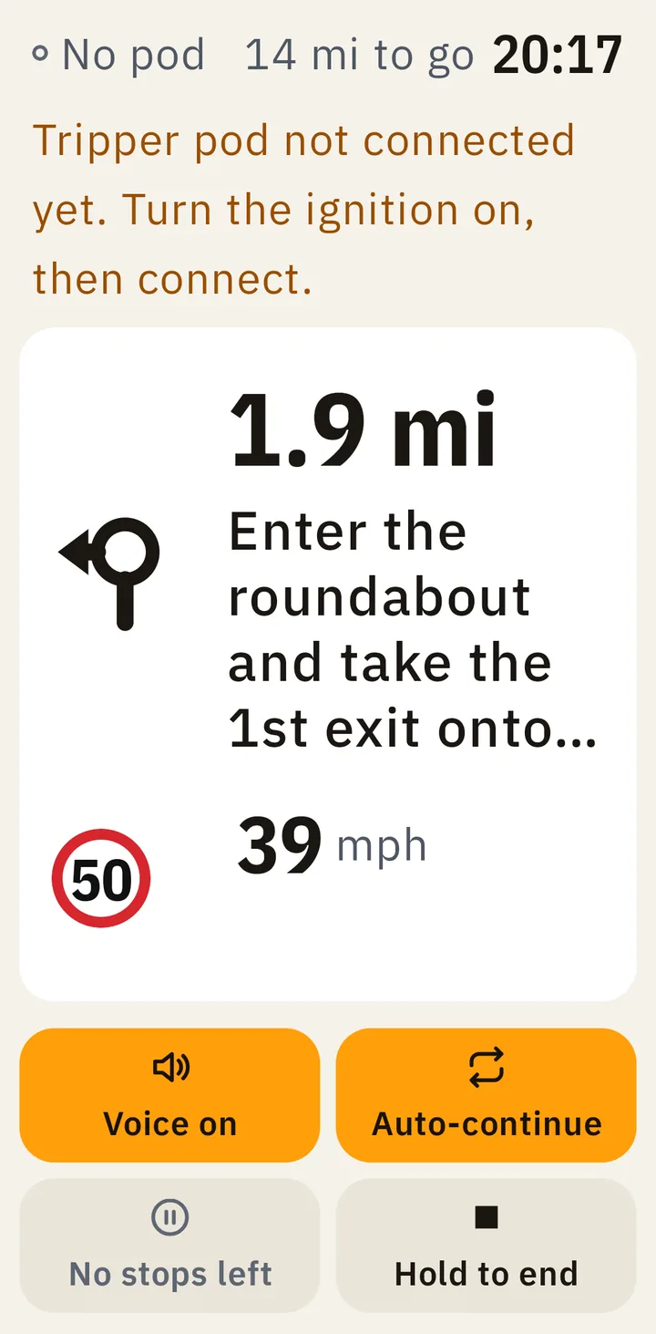
- At the largest text sizes, your speed and the limit stay on the ride screen. Button labels wrap or stack instead of being cut off.
- Leaving the route is noticed about a second sooner, so the new way is found sooner.
- Pairing with the Tripper pod no longer gets stuck when the pod doesn’t answer a PIN. It starts again instead.
- When the pod turns down a direction, it no longer keeps showing the old one.
- Error messages are in plain words.
What we fixed
On the ride
- At a large text size, a long turn no longer pushes your speed off the ride screen. The turn’s words are cut short instead.
- Crossing the limit no longer makes the speed row jump.
- When the row is full, a lower limit coming up moves under your speed instead of being squeezed in.
- Leaving the route is noticed on the first GPS reading that leaves it, about a second sooner.
Your Tripper pod
- Pairing no longer waits forever for a PIN the pod never answers. It starts again, and asks for the PIN the pod is showing now.
- When the pod turns down a direction, the old direction stops repeating, and one waiting to be sent is dropped too.
Reading and tapping
- At large text sizes, button labels wrap, or the buttons stack, instead of being cut off.
- A choice that needs two lines, in a row of choices, is no longer cut off.
- The route screen’s stops, title and figures fit at large text sizes. Figures move to a new line rather than being cut.
- The number on the stop screen’s amber badge is easy to read.
Tablets
- A drag in the side margins scrolls the screen.
- The place picker’s offline message keeps to a phone’s width.
Messages
- No message shows technical text. Each one says in plain words what went wrong.